by Haptix Touch
Funded!
This project successfully raised its funding goal on Sep 13.
Transform any flat surface into a 3D multitouch surface to control your computer, TV, or any other screen.


Update 2: Haptix: both a mouse and a... keyboard? Check it out here!
Update 3: Design in 3D or play first-person games with only your fingers! Check out some awesome videos of Haptix!
Work or play, make life easier with Haptix.
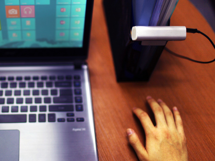
Multitouch is fun and natural to use, but it's only present on a few devices. Because tablets and smartphones are easy to use, they're also easy to enjoy. But as great as multitouch screens are, it's still hard to beat the mouse/keyboard combo when it comes to productivity. We wondered if it was possible to combine the best of both worlds -- introducing Haptix.Haptix turns ANY surface into a multitouch surface. It's a sleek bar that you can place flat or clip on something elevated to enable multitouch on any flat surface, such as a table, window, or screen. You can then control any computer by tapping, pinching to zoom, or swiping to scroll on that surface itself. It's as intuitive and natural as a multitouch screen, just without the actual screen.
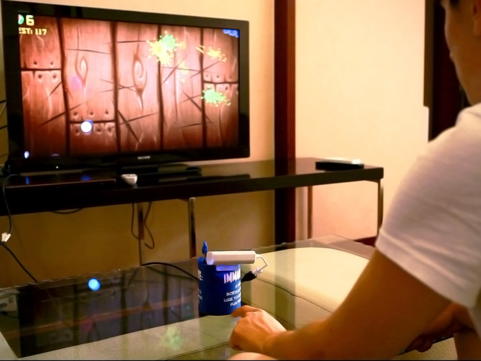
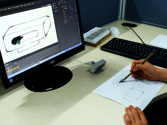
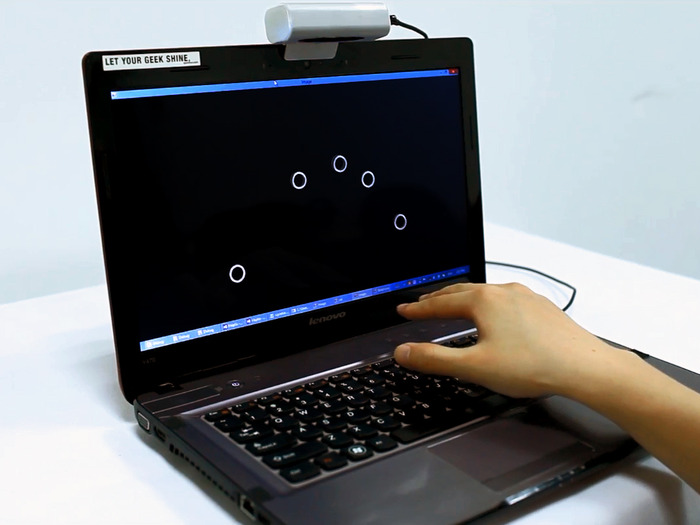
Haptix is a mouse-killer.
Can Haptix replace the mouse? We believe it can. Point it at your table, and bam, use your hands as your mouse and much more. Haptix can be used in 3 modes:- Multitouch
- Trackpad
- Mouse
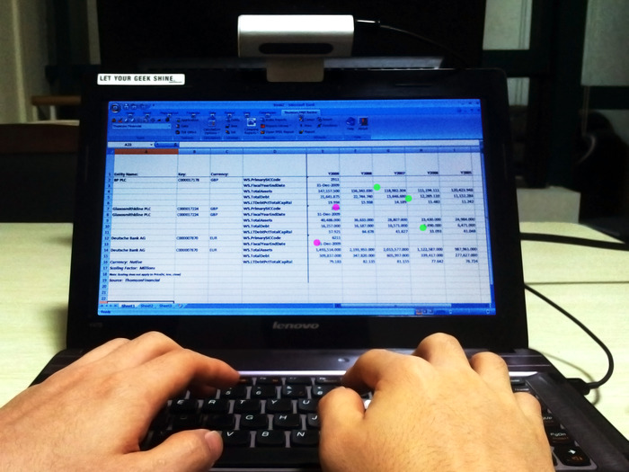
Create two layers of interaction with 3D multitouch.
3D multitouch adds a layer of 3D sensing on top of a layer of multitouch. These two forms of interaction complement each other perfectly and each makes up for what the other lacks. Your fingers' positions are captured even before they touch the surface, so you know what you're controlling when you tap or pinch on the surface.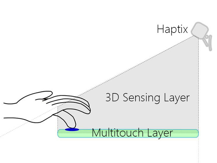
- Gives you tactile feedback (the satisfying feel of touch)
- Allows you to rest your hands on a surface
- Lets you define the space of operation
- Allows you to control things on a surface with precision
- Has practical applications in improving productivity
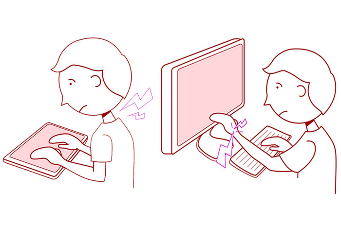
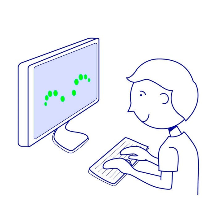
A few ways we love using Haptix:
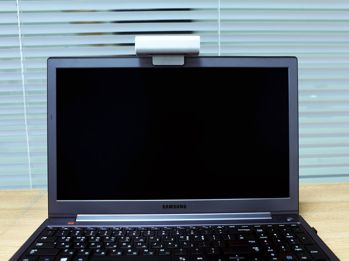
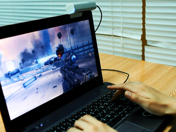
Clip it on top of your laptop. Turn your keyboard into a multitouch keyboard, and then control your computer ENTIRELY FROM your keyboard. The surface of your keyboard becomes a multitouch pad, so you glide your fingers across the top of the keys. Remember those pesky Excel sheets that make you keep going between mouse/trackpad and keyboard? Remember wanting to play a first-person shooter game but not having your mouse? With Haptix, those days are gone. To set it up, simply plug it in, do a quick four-point calibration, and you'll be up and running! Worried about typing? Don't worry, Haptix automatically deactivates when you type.Haptix works on Windows XP/Vista/7/8 and Ubuntu
We're working hard on great hardware and production quality.
Haptix has an anodized beadblasted aluminum casing for a great look and feel. Having tried various materials, we believe that nothing beats a sleek aluminum finish, and we hope you agree.
Haptix is basically a camera. Or more specifically, Haptix consists of two CMOS image sensors (those you find in your webcams), which capture the position of your hands in 640x360 resolution, attached to a microcontroller, which does most of the processing so your computer doesn't have to. It works with visible light, but employs infrared when environmental illumination is low, so it works in the dark too! Haptix connects to your computer through a USB 2.0 cable.

- Aluminum factory: We've made molds for the aluminum and plastic parts.
- Component suppliers: We've tested samples of image sensors and other components from suppliers, and have secured the best ones.
- Contract manufacturers: We've gone back-and-forth over schematics, assembly, and packaging -- finalizing tooling will be our next step.
- USPS: For when we're ready to ship!
- November: Perform a sample production run, then debug and test
- February: Start shipping
What's next?
Support for Android and OSX. We want you to be able to use Haptix with your Android smart TVs and MacBooks, and are hard at work on that. We'll make sure Haptix works on those platforms by the time it ships!Developer SDK. Haptix integrates with your system right out of the box, which means that you can use it with pretty much any program. But you may have ideas (the crazier the better) on how you'd like to manipulate tracking data from Haptix (from 3D motion sensing to gesture control), and we want you to try those out!
360° hinge. The front piece on Haptix's clip doesn't interfere when you close your laptop (it's as thin as a credit card), so our next step in making Haptix something you can leave on your laptop all the time is to design a cost-effective hinge for Haptix that allows you to bend it all the way back. This way, Haptix can sit unobtrusively on top of your laptop when you pack it in a bag.
We need you.
We can't wait to get Haptix into your hands. Our Kickstarter will fund refinement of the electronics and additional tooling for mass production. It'll also give us an idea how many to include in our first production orders, so it's your chance to be the first to enjoy interacting with your computer in an entirely different way. If we go over our Kickstarter goal, we'll be able to develop additional features for you such as different colors and other cool stuff we have planned. More on that later!Join us! When you use Haptix for the first time, you'll have the satisfaction of knowing that you helped make it happen. Take part in this movement to change how YOU interact with your computer.
Let 3D multitouch improve how you interact with computers - for good.


 Posts


Saroj Shrestha
September 3rd, 2013 1:48 pmMartinspire
September 3rd, 2013 2:14 pmDieter Mueller
September 3rd, 2013 2:36 pmBefore the Pseudo-3D Style was made so simple even Pixel Monkeys could do it with Shadows and Light Effects – everything was “flat”.
Wrong Argument #1: Flat Design reduced Information Overload.
Any UX-Designer or IA will tell you that the Interfaces hold the same Amount of Information – just the visual Representation is less ornamental.
———-
Wrong Argument #2: Flat Design is “simple” or brings Simplicity.
Not it isn’t. It is made to look simple. It a Question of Perception, not Reduction or Simplification of the Interface and it’s Elements.
The Author confuses Simplicity with Reduction. For example GMails new Compose Windows looks simpler, because it has reduced the Number of Elements – but it also means that the User has to make more conceptual Leaps to get his Tasks done. To open the Formatting Option you now require an additional Click just to open that Toolbar – which means the User has to remember the Interface and even understand the conceptional Leap that a certain Icon represents the Formatting Option.
Once again it’s about Perception: the Interface is not simpler and nor is it a Simplification of the actual Functionality and Workflow – but Eye Candy and hiding perfectly useful Function for the Sake or being cool and trendy.
So Simplification often causes unnecessary conceptional and cognitive Leaps by the User – hardly an Achievement in Terms of good Usability and actual Simplicity.
———-
Wrong Argument #3: Obviousness of Controls
No, not everyone immediately gets every Interface, even when they have worked for Decades with Gadgets and Computers.
Why shouldn’t Controls be obvious, clearly identified and labelled?
Because Designers are bored of doing their Homework? Or because Buttons spoil their pretty Photoshop Designs?
Unless you customizable Interfaces or a Pro and Beginner Version any Interface should be as comprehendable and clear as possible.
Even so called digital Natives are often not as sophisticated as they think and any Interface requires a learning Curve as well as conceptional Leaps.
The Designer should provide a solid Interface and possible a Choice for the User to customize his/her Experience – Empowering the User doesn’t mean hiding Stuff, just because we ASSSUME the User has it all figured out.
Especially Google has that terrible Habit of making their Offerings “Auto-Awesome”, which doesn’t empower the User, but make him/her a Bystander in the Workflow. This takes away the Chance of actually learning a Tool and some Skills as well as Choices with the Workflow / Creative Process.
This dumbs down the Users – it doesn’t empower them. Power comes from Knowledge and Knowledge comes from Learning. Take away the Chance of Learning and you get a Pavlovian Button-Presser.
———
Contrast is King? The Author illustrates his Points by using many Screenshots that have miserable Typography and Colour Choices that have hardly any Contrast at all.
This is currently very prevalent in Flat Design: dark Grey Typo on medium Grey Background – no Contrast at all (this also applies to the Example of White Type of Yellow Background). Often they also use very delicate / thin Fonts that offer also no Contrast, especially on mobile Devices in Sunlight.
J Gallaher
September 3rd, 2013 2:57 pmIt’s actually really confusing and things are misplaced. Example, signing out and settings are in two different areas that are hidden away.
David G.
September 3rd, 2013 3:40 pmCan you also give some design advice in addition to your (constructive?) criticism? Like what do you consider good typography or contrast color schemes? And how would you make interactions obvious?
Libbie
September 3rd, 2013 3:10 pmNowadays, people innately know how to use a smartphone/tablet so the interface is allowed to become less obvious, more stripped back, and that kind of paves the way for a ‘simpler’ design.
Sean
September 3rd, 2013 3:46 pmAdrian Taylor
September 3rd, 2013 4:11 pmArgument #1: Flat Design reduced Information Overload.
I agree that there is the same about of media (text, image, video, etc.) in a flat design as in a more dimensional design however I would argue that every item in a design requires effort by the user to decode. Less elements often means less work. Now this is not to say that you can’t make a dimensional design easy to parse, just an example of a possible benefit.
Argument #2: Flat Design is “simple” or brings Simplicity.
I agree with you here and don’t believe that I ever made that argument that flat inherently creates simplicity. In fact, I would suggest that a reduced use of dimensionally in your design often makes it more difficult to create an obvious / intuitive interface. Good usability and aesthetic style are separate concerns. I do feel that when designs attempt to work with a reduced visual pallet it can help to focus their efforts on usability rather than decoration, but not always. I think we both agree that simplicity is hard to do right.
Argument #3: Obviousness of Controls
I think we are actually aligned on this point. Flat does not make things more obvious, it often makes them less so. When designing flat you must work even harder to make things intuitive. A big shinny button with a drop shadow is almost always going to be more obvious then a thin white arrow on a flat background. Before working flat designs must consider whether it is the right style for their audience and then word diligently to ensure usability.
Thanks again for your thoughts!